Creatyea Design Systems
Introduction
What is Creatyea?
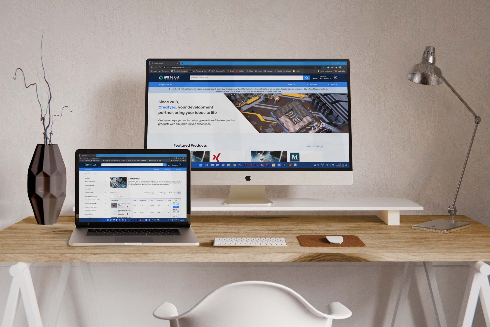
Creatyea Technology provides electronic components, such as resistors, capacitors, transducers, and other circuit-related parts. Their platform aims to support innovation in electronics by offering high-quality products and resources for building and optimizing circuits. The company is based in Shenzhen, China, and serves as a hub for electronic solutions and related service.
Increasing efficiency, scalability and cross-team collaboration
The Creatyea Design System is meticulously crafted to enhance design and development process for front-end developers working on a multi-vendor e-commerce platform.
What did I accomplish?
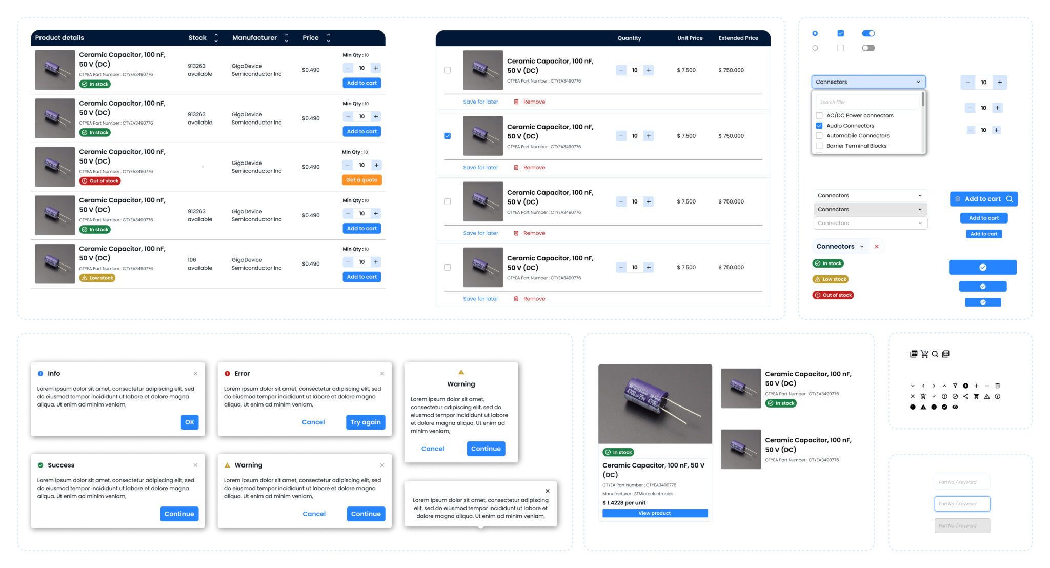
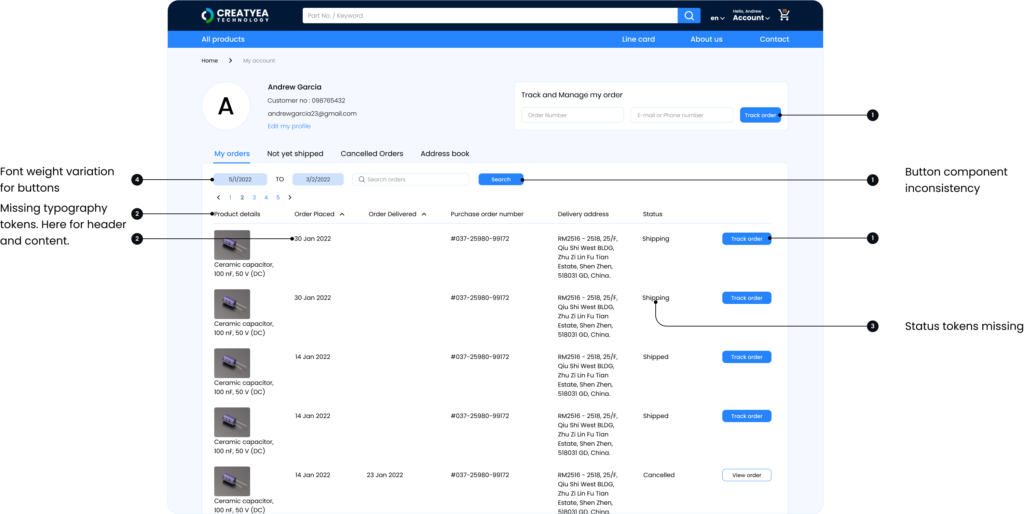
I created multiple variations for each component, making sure the design system worked well across different product use cases and adjusted smoothly to various screen sizes. I also took an active role in building the design system components directly in Figma.
Area of work
User Experience
Design Systems
Component Design
Team
Product Designer (Me)
Sr. Product Designer
2 x Developer
1 x QA
Impact: ~42% reduction in the total development time.
Laying the land
Problem at hand
Engineers built the website’s design on an as-needed basis, leading to inconsistencies and making collaboration between design and development teams difficult.
34%
user dissatisfaction rate related to interface inconsistencies.
5h~
Engineers spent time per day recreating components
Project Goal
Target Audience
Why it mattered? The project improved…
Scalability
A need for scalable design across products.

Design Fragmentation
Multiple teams led to inconsistent designs.

Development Bottleneck
Communication gaps caused delays.
Process

Selected Insights
No fluff, simple, scalable design system
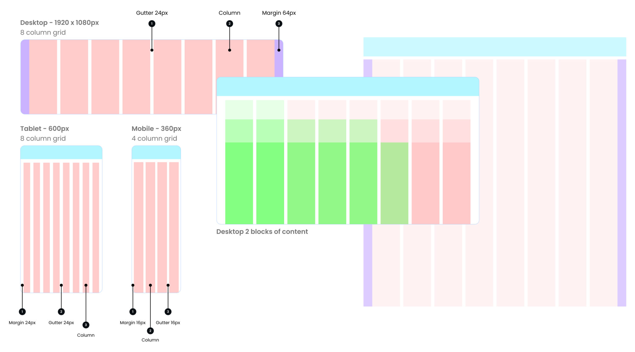
Responsive layout grid
A standard set of layout grids and breakpoints, was critical in ensuring we could design and build quickly and consistently.
We used the basic unit of our Grid geometry is the 8-pixel square mini unit. Using this system provided a shared understanding between design and development and allows for smooth handover and back and fourth between the two.
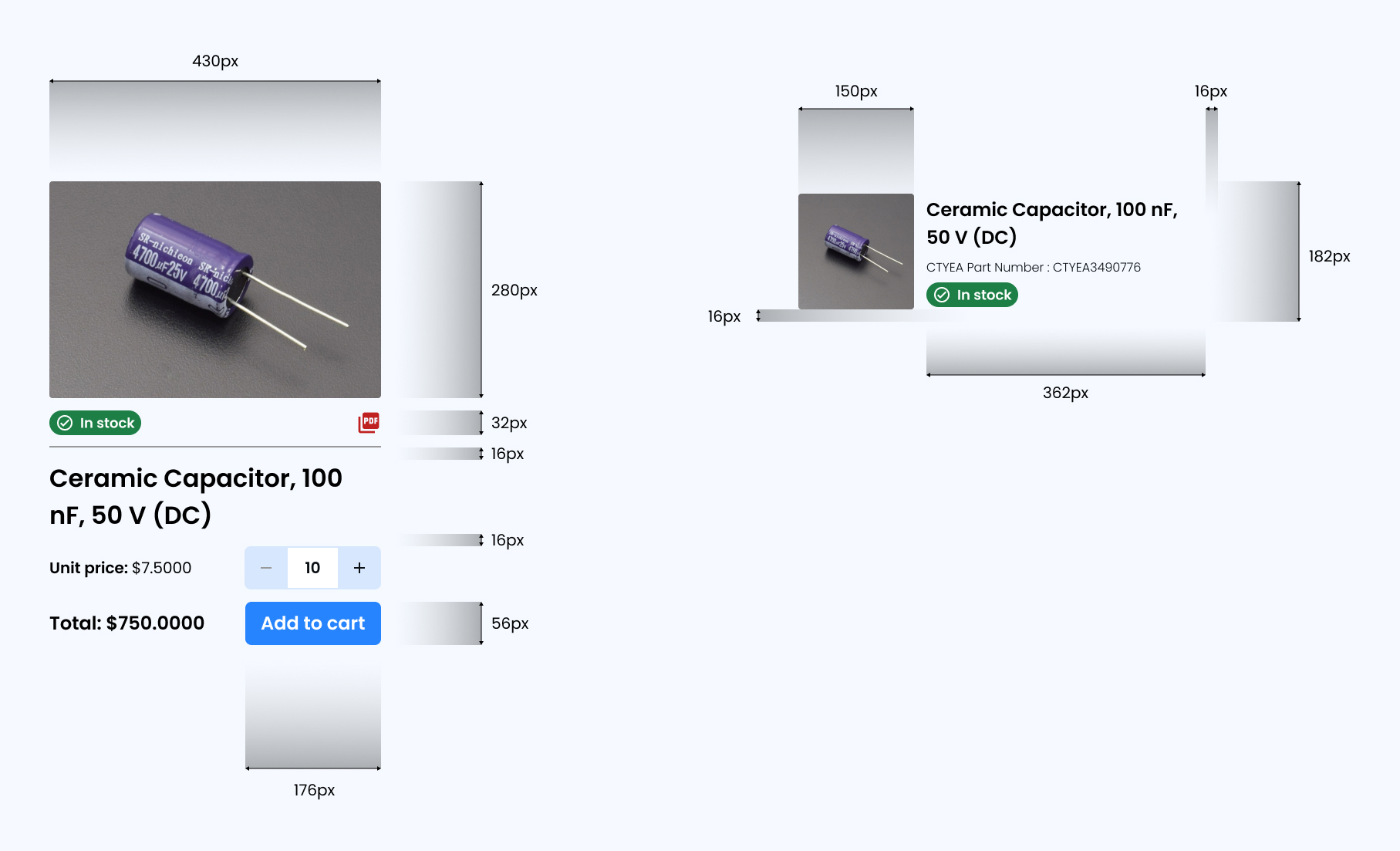
Making components versatile and dynamic
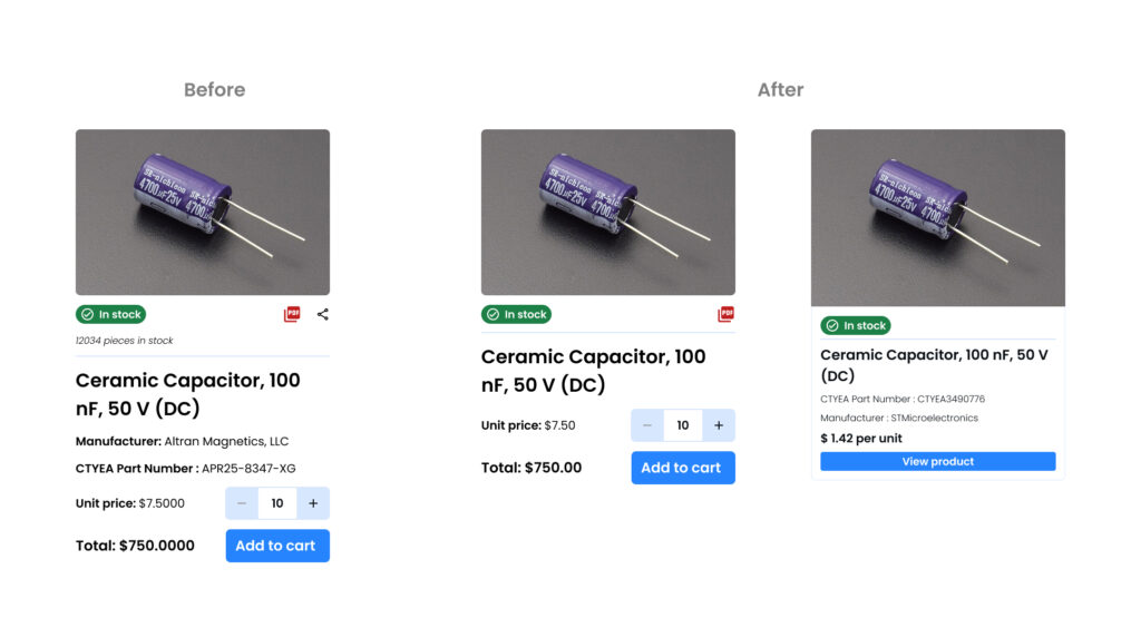
We designed key components, like the product card component, focusing on readability and responsiveness for different screen sizes.
I put a lot of emphasis on documenting design specs to foster smooth design-engineering collaboration.
Building block for detailed customization
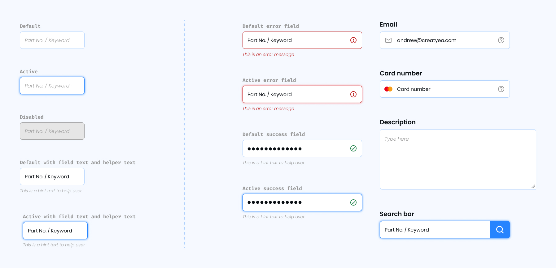
Text fields are used to gather user input in a structured and organized way. They facilitate the completion of tasks, enabling users to provide, modify, or verify information efficiently.
Final few components and usage guidelines
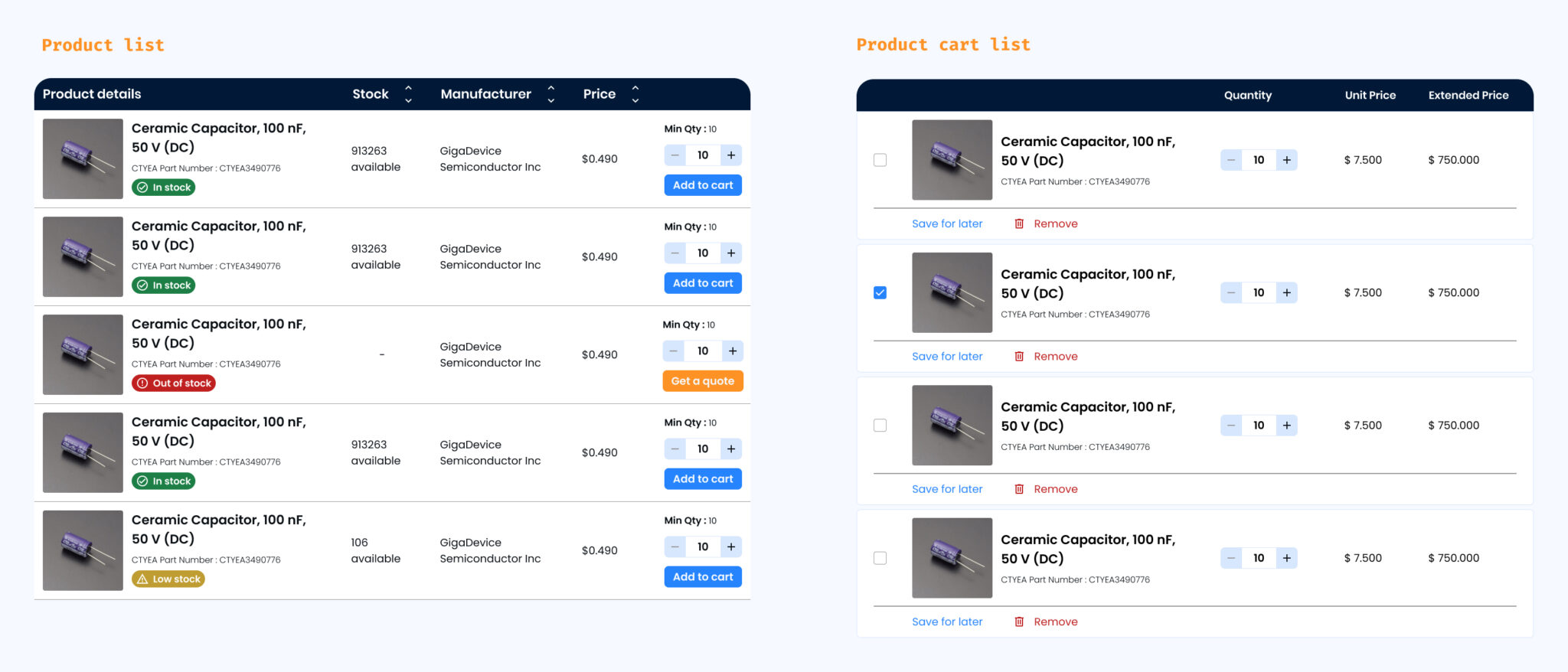
Lists
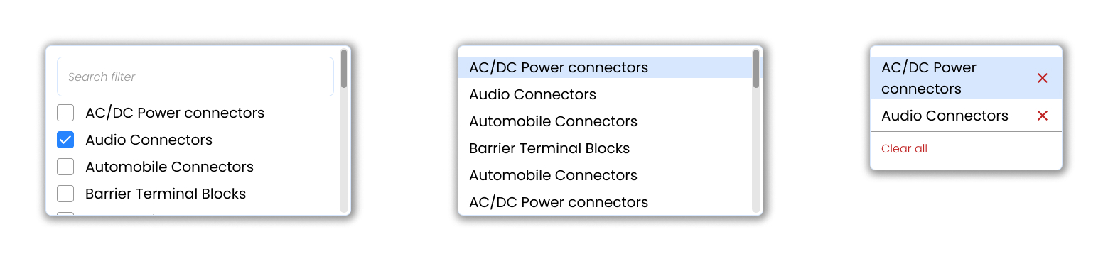
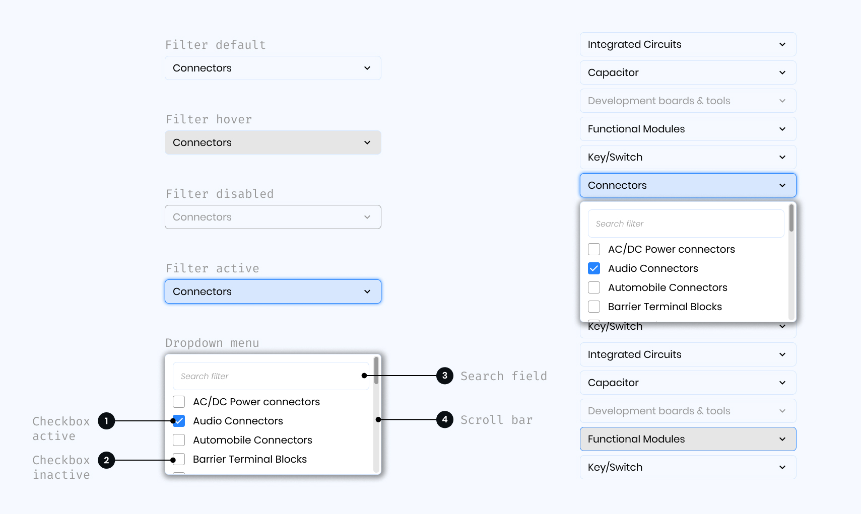
Dropdown
Usage Guidelines: Dropdowns can be used in forms on full pages, in modals, or on side panels. It is used to filter or sort contents on a page. It is a stylized version of the select component and can be styled as needed.
Buttons
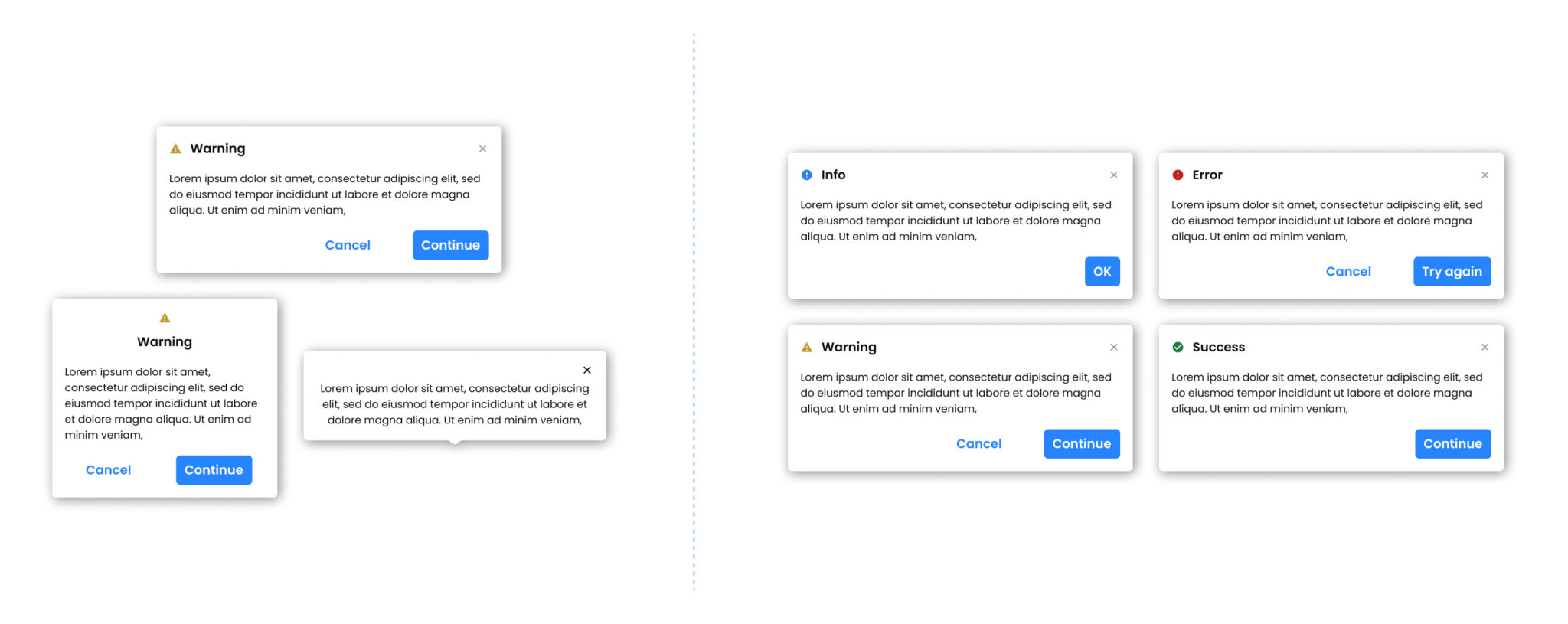
Dialogue box
In Creatyea’s interface, dialogue boxes are designed with the user in mind, providing a seamless way to confirm actions, access additional product insights, or make quick decisions. They appear when you need to focus on a specific task, such as finalizing component selections or checking out. Dialogue boxes ensure that critical information is presented clearly and concisely, helping you stay in control without unnecessary distractions.
Filters
Usage Guidelines: Use filters to help the user narrow down the scope of information via categories, inputs and ranges so they can find the information they are looking for.
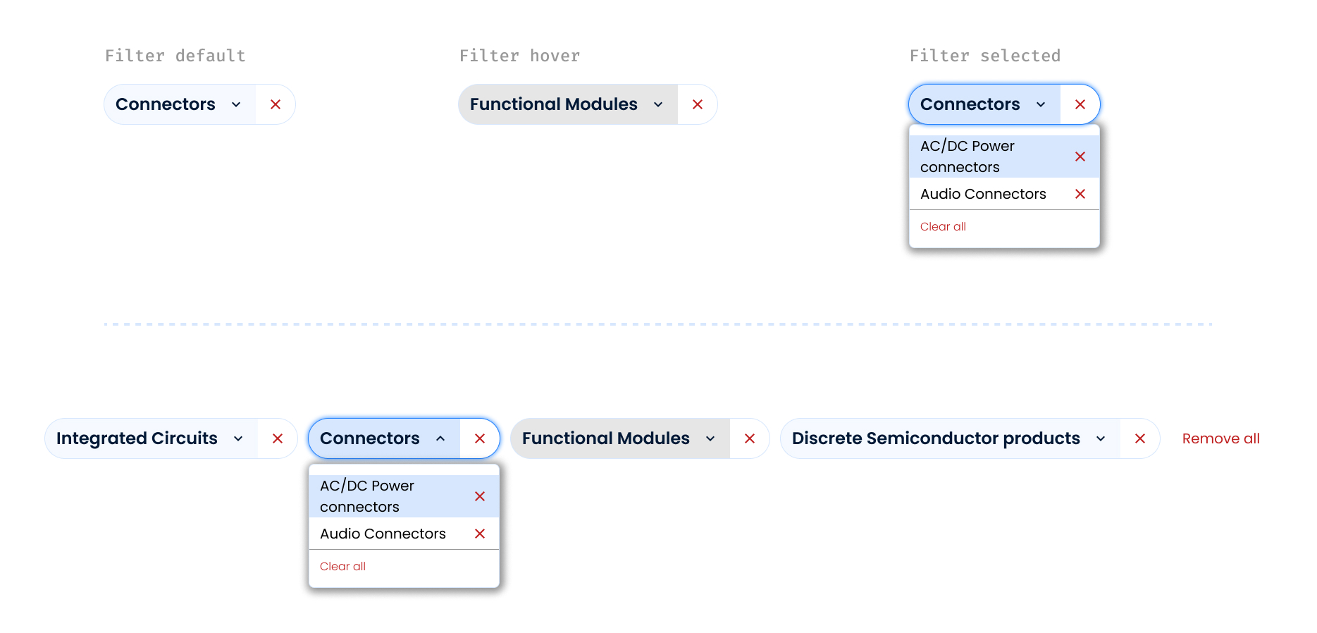
Filter pattern: Multi-select filter
Usage Guidelines: When an array of dropdown filters consists of one or more multi-select filters, use this pattern to allow the user to easily edit and clear selections.
Challenges & Iterations: Learning Through Doing
The design process wasn’t perfect—and that’s what made it powerful. Each roadblock helped shape a stronger, more scalable system. Here’s a look at where things went wrong and how collaboration helped course-correct:
Over-engineered Components
What happened: The first version of the card components was too complex, trying to solve every use case in one design.
What we did: Developers raised concerns about bloated props and inconsistent behavior across views. We revisited these with the dev team and broke them down into modular variants.
Lesson learned: Simplicity and flexibility often trump a one-size-fits-all approach.
Grid System Confusion
What happened: Designers and developers initially interpreted the spacing rules differently, leading to misaligned layouts.
What we did: We held a sync session to align on pixel grids and spacing tokens, and documented examples clearly in the Figma file and design tokens.
Lesson learned: Assumptions kill clarity—shared language and visuals are essential.

Documentation Gaps
What happened: Early on, developers struggled due to missing or ambiguous documentation.
What we did: Created a central “How to Use” section for each component in Figma and Notion, including do’s/don’ts, edge cases, and code references.
Lesson learned: A design system is only as good as how easily it can be used.
Reflection and learnings
This project reinforced the significance of meticulous attention to detail, the iterative design process, and effective collaboration within a cross-functional team. It also highlighted the need for balance between user experience and visual polish to create a design system that is not only aesthetically appealing but also functional.